
Skechers Rebrand
Identity Systems
Art Direction


Making Skechers Gen-Z friendly.
Skechers is the world's 3rd largest sports brand. With a focus on functionality, and with their primary audience being the older generation, the brand's emphasis on brand aesthetics and a strong visual identity is, lacking.
Leading to an inability to participate in mainstream sneaker culture, which is widely evident through their lack of presence on reselling websites like Stockx GOAT and websites that cover culture, like Complex and Hypebeast.
Their lack of connection with the young adult audience is a problem as the Gen Z is the future of the … and participating in youthful culture would be widely benefecial to skechers. can skechers penetrate through to a teenage audience?
DESIGN PROBLEM, Lazy & Messy Typography + Imagery

The home page of their website is a good example of the cluttered, eclectic and visually busy, due to the need to cater to a wide variety of audiences. But as the saying goes, if you're catering to everyone, you're catering to no one. Furthemore, the design of the homepage also features poor typographic choices, textures and lazy composition choices.
The home page of their website is a good example of the cluttered, eclectic and visually busy, due to the need to cater to a wide variety of audiences. But as the saying goes, if you're catering to everyone, you're catering to no one. Furthemore, the design of the homepage also features poor typographic choices, textures and lazy composition choices.
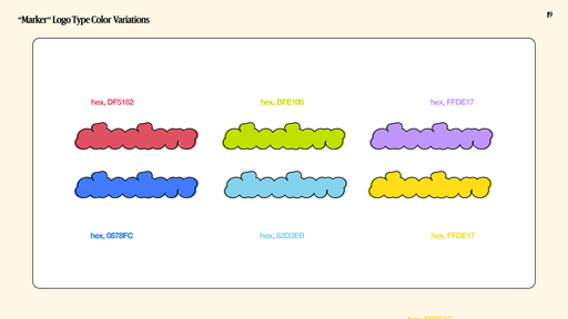
Art Direction

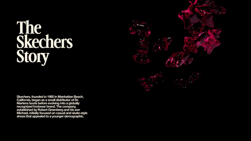
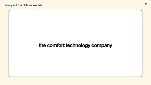
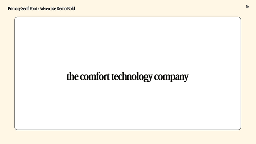
Comfort Technology
Primarily featuring the 4 pointed star as the main symbol, all art related to the brand's new visual direction visualizes the Skechers' primary motto, "the comfort technology company". As this is at the heart of the brand and applies to everything that they do.


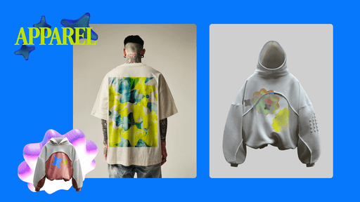
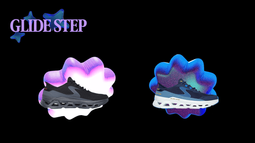
Old Visual Assets