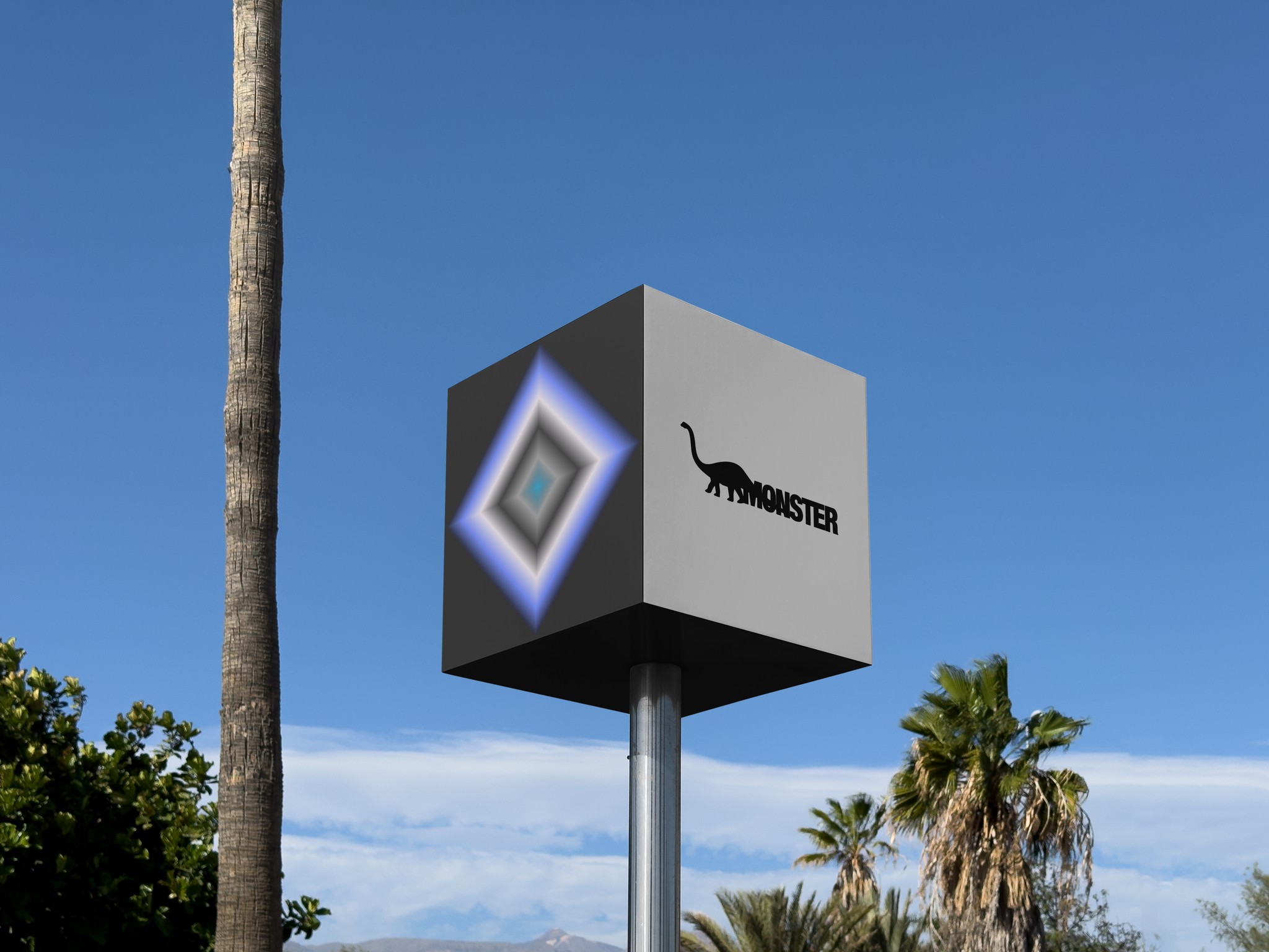
Gentle Monster
Art Direction
A type-based brand refresh, that began with an instinct.
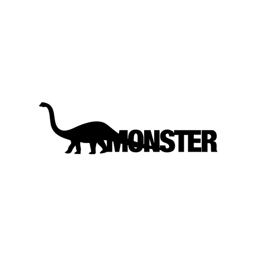
I was in class when someone presented the Korean eyewear brand, Gentle Monster. The ring of the name inspired a quick sketch, which was a pretty accurate representation of how I felt when I first heard the name.
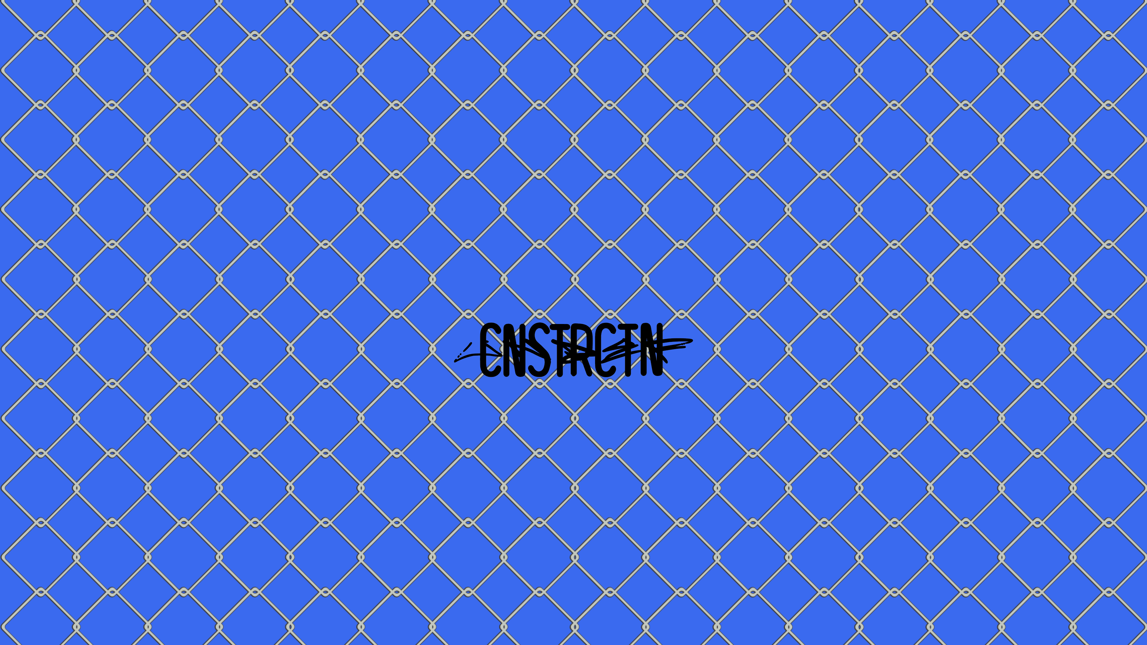
This rebrand is inspired by a one minute sketch, which captures the inherent tension between the words 'gentle' and 'monster.'

1 minute sketch in class.
The letters are sleek yet fragile, bold yet broken.

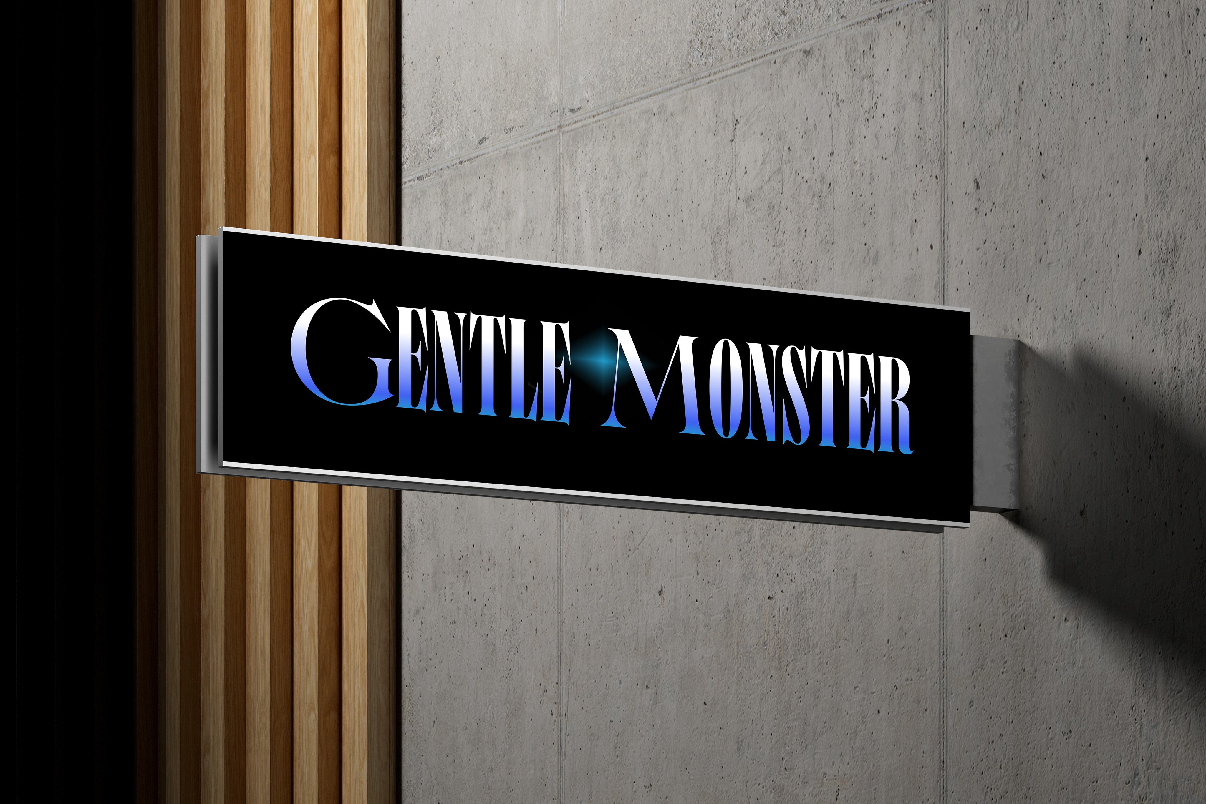
Translated into the first graphic logo.
Chosen Art Direction

I was shooting for a neo-noir aesthetic,


Second Logo

The Comfort Technology Company
All art related to the brand's new visual direction visualizes the Skechers' primary motto, "the comfort technology company". As this is at the heart of the brand and applies to everything that they do. Primarily featuring the 4 pointed star as the recurring symbol.

Dragon Scales made with overlapping typography.
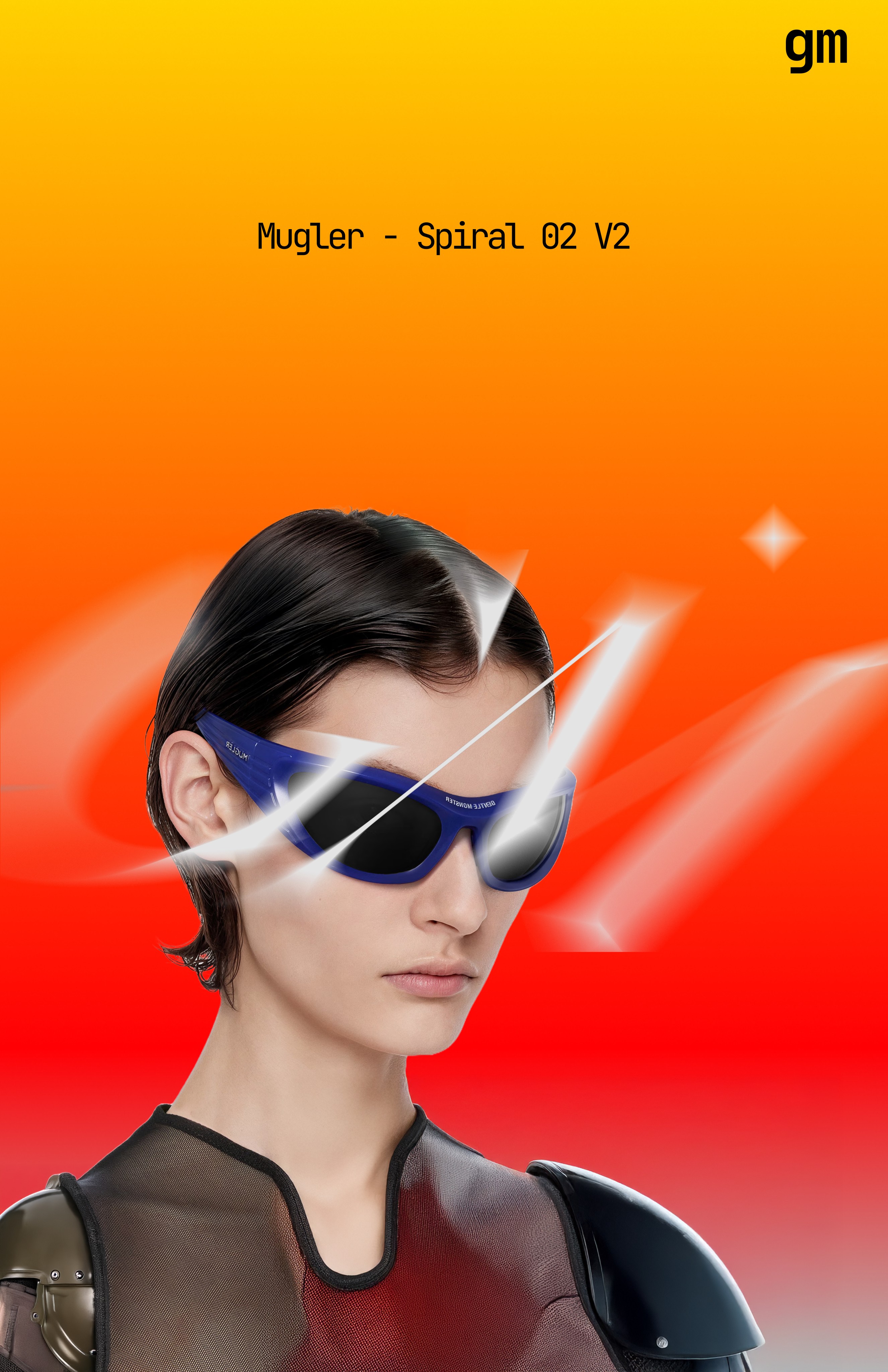
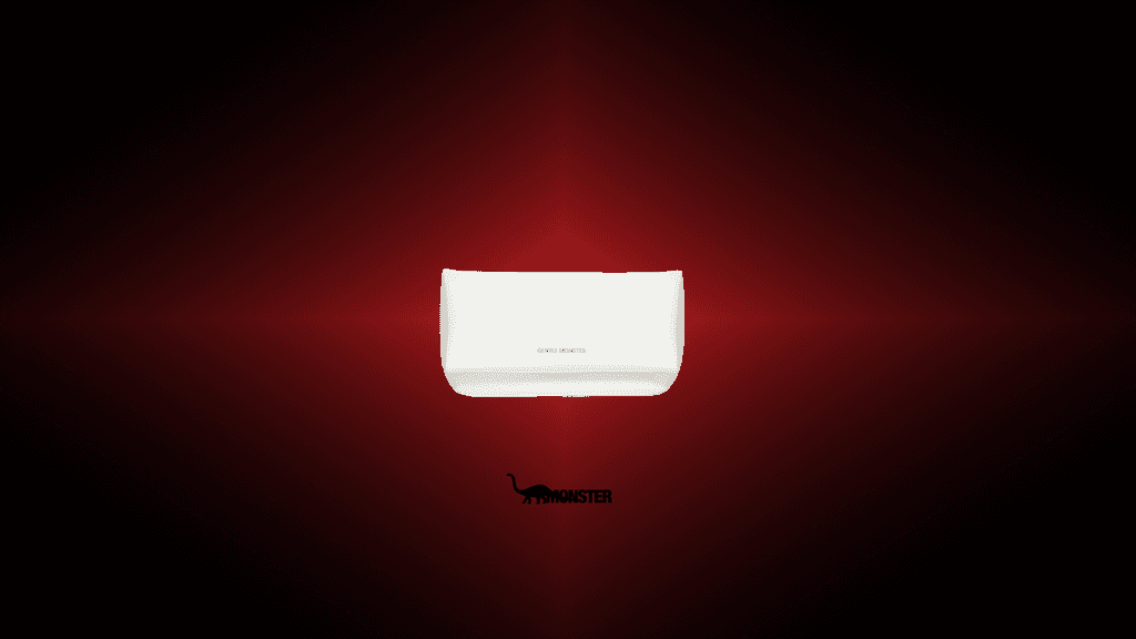
Eyeglass Cases
Creating intrigue through the unknown.
All art related to the brand's new visual direction visualizes the Skechers' primary motto, "the comfort technology company". As this is at the heart of the brand and applies to everything that they do. Primarily featuring the 4 pointed star as the recurring symbol.